
Kuzushiji-49: An Introduction to CNNs
Part 1: Background and Exploratory Data Analysis
The full code can be found in the gitub repo: Kuzushiji-49-CNN
Introduction
Here we will explore the application of Convolutional Neural Networks, a type of deep learning (or artificial neural network) to the problem of image classification using the Kuzushiji-MNIST dataset.
Classification refers to predicting the “class label” for an observation in a dataset or a new observation, given a set of data with accompanying labels. In machine learning parlance, classification is a type of supervised learning as the data are labelled.
More generally speaking, the machine learning task here is to train a model to correctly identify the category of an observation. In the case of computer vision problems such as the one we will tackle here, this corresponds to identifying to which category an image most likely belongs, given previous examples.
The Data
The “Hello World” of computer vision is the MNIST dataset, which is composed of standardized images of digits 0-9, where the learning task is to train a model to identify handwritten digits.
The dataset we will be working with here, the Kuzushiji-49 is for a similar but more complex task, where the goal is instead to train a model to identify one of 49 handwritten Japanese characters in the hiragana writing system.
First, we will need to download the data. There is a downloader utility provided in the official github repo you can use, however, I will just grab the specific files needed for the dataset we’ll be working with here.
We can do this on our local machine by running the following terminal commands (curl does not play nicely with Jupyter, unfortunately):
- Training data:
curl http://codh.rois.ac.jp/kmnist/dataset/k49/k49-train-imgs.npz -O data/k49-train-imgs.npz - Training labels:
curl http://codh.rois.ac.jp/kmnist/dataset/k49/k49-train-labels.npz -O data/k49-train-labels.npz - Testing data:
curl http://codh.rois.ac.jp/kmnist/dataset/k49/k49-test-imgs.npz -O data/k49-test-imgs.npz - Testing labels:
curl http://codh.rois.ac.jp/kmnist/dataset/k49/k49-test-labels.npz -O data/k49-test-labels.npz
There is also a classmap file, to map the integer class labels (0-48) to the hiragana characters:
curl http://codh.rois.ac.jp/kmnist/dataset/k49/k49_classmap.csv -O data/k49_classmap.csv
To load and visualize the data, we will need the fundamental pieces of the data science stack in python, numpy for loading and working with the image arrays, pandas to make wrangling the data easier, and matplotlib for visualization. We import these here:
# Import the holy trinity of data science
import numpy as np
import pandas as pd
import matplotlib.pyplot as plt
Training Data
First, we can load the image data and take a look at the images which comprise the Kuzushiji-49. These are stored in compressed .npz format, and for this dataset contain a single 3-D numpy array of all the images, arr_0:
# Load the data from numpy format
train_img = np.load('data/k49-train-imgs.npz')

# Check the shape of the stored array
train_img['arr_0'].shape
(232365, 28, 28)
As we can see, the training set has 232,365 images, of size 28x28 in monochrome (as there is no fourth dimension of size 3 present for red, green, blue color channels, as in many computer vision problems). This is the same format as the MNIST dataset.
Now let’s pull the data out into our X_train array:
# Just the data please
X_train = train_img['arr_0']
Each single image (row) is a 28x28 numpy array with values between 0 and 255:
# Look at the shape of a single image
X_train[4,:,:].shape
(28, 28)
# Visualize
plt.figure(figsize=(2,2))
plt.title('Hiragana Image #5')
plt.imshow(X_train[4, :, :], cmap='gray_r')
plt.show()
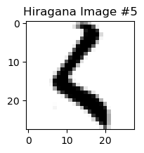
We can see that image 5 (at index 4) is that for the hiragana for ‘ku’. Now we can take a look at some examples of the data:
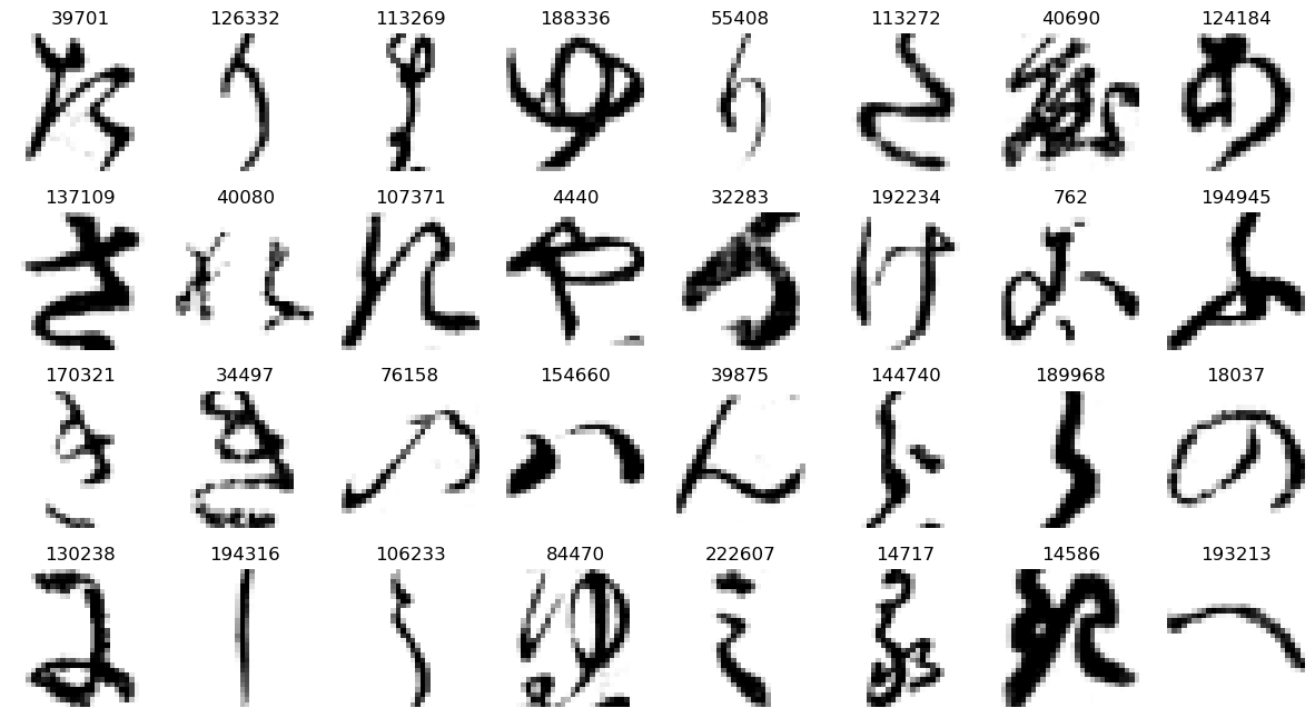
# Create a random array of indices between 0 and the number of images of size 32
rand_ind = np.random.randint(0, X_train.shape[0], 32)

# Create subplot grid
plt.subplots(4, 8, figsize=(15, 8))

# Iterate and show each randomly selected image
for plot_index, img_index in enumerate(rand_ind):
    plt.subplot(4, 8, plot_index + 1)
    plt.title(img_index)
    plt.axis('off') # hide axes
    plt.imshow(X_train[img_index, :, :], cmap='gray_r')

plt.show()
We also have the class labels associated with each image, which show which hiragana character each image is supposed to be. These are contained in a separate file, which we load the same way:
train_labels = np.load('data/k49-train-labels.npz')
Let’s take a look at how the class labels are structured:
# Check size
train_labels['arr_0'].shape
(232365,)
train_labels['arr_0']
array([30, 19, 20, ..., 10, 39, 30], dtype=uint8)
We can see that there is a distinct class label for each row in the training data, as the dimensions match - 232,365 class labels. We can also see that each class label is just a simple integer. Let’s pull out the training labels into a pandas series, for convenience:
# Pull out the class labels into a pandas series
y_train = pd.Series(train_labels['arr_0'])

# Check
y_train.head()
0    30
1    19
2    20
3    30
4     7
dtype: uint8
We will also load the class map data - this is to serve as our lookup table of the integer classes to the hiragana character names. This file is a csv and so we load directly with pandas using .read_csv:
# Load the class map
classmap = pd.read_csv('data/k49_classmap.csv')

# Take a look
classmap.head()
| index | codepoint | char | |
|---|---|---|---|
| 0 | 0 | U+3042 | あ |
| 1 | 1 | U+3044 | い |
| 2 | 2 | U+3046 | う |
| 3 | 3 | U+3048 | え |
| 4 | 4 | U+304A | お |
Now let’s see if there are equal numbers of images (or nearly so) for each character in the training data, or in the machine learning practitioner’s parlance, if we have a balanced classification problem - technically speaking, what is the support for each class?
We’ll replace the numeric indices with the characters here using the classmap. Unfortunately, the default font for matplotlib does allow rendering of Japanese characters (at least not on Windows), so we will need to specify a different font.
There are some good resources on this below if you’d like to explore further on your own:
import matplotlib
matplotlib.rcParams['font.sans-serif'] = ['Microsoft YaHei', 'sans-serif']
np.unique(y_train.value_counts().values, return_counts=True)
(array([ 392,  417,  777, 1598, 1718, 1993, 2063, 2139, 2397, 2451, 2565,
        3060, 3394, 3523, 3867, 4165, 4714, 5132, 6000], dtype=int64),
 array([ 1,  1,  1,  1,  1,  1,  1,  1,  1,  1,  1,  1,  1,  1,  1,  1,  1,
         1, 31], dtype=int64))
We can see out of the 49 hiragana characters, the vast majority have an equal number of observations with 6000 observations - 31/49 or ~63%. For each of these, this represents about 2.6% of the dataset:
6000/X_train.shape[0]*100.0
2.5821444709831516
The remainder have less, let’s look only at only these hiragana:
# Find the observation count per character and change the index to the characters from the class map
char_counts = y_train.map(classmap['char']).value_counts()

# Create a bar plot for only those with less than 6000 observations
filtered = char_counts[char_counts < 6000].sort_values()

filtered/X_train.shape[0]*100.0
ゑ    0.168700
ゐ    0.179459
え    0.334388
ゆ    0.687711
む    0.739354
ほ    0.857702
ぬ    0.887827
ろ    0.920535
わ    1.031567
ね    1.054806
ち    1.103867
み    1.316894
め    1.460633
ゝ    1.516149
そ    1.664192
せ    1.792439
け    2.028705
ひ    2.208594
dtype: float64
It appears that for those without the standard number of observations, the range varies from similar (~2.2%) to very low (<0.2%). Let’s visualize in a more appealing graph below:
# Create plot
ax = filtered.plot(kind='barh')
plt.title('Class Support for Less Frequent Hiragana in Training Data')

# Get bars
rects = ax.patches

# Create labels
labels = filtered.apply(lambda x: f'{x} ({np.round(x/X_train.shape[0]*100.0, 2)}%)')

# Iterate over bars and add annotation
for i in range(0, len(rects)):
    ax.text(rects[i].get_width() + 500, rects[i].get_y() - 0.1, labels[i], ha="center", va="bottom")

# Remove borders / x-axis (unneeded)
plt.box(False)
ax.get_xaxis().set_visible(False)

# Display final result
plt.show()
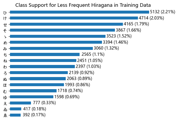
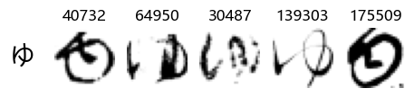
We can see that some hiragana represent less than 1% of observations, and the couple the are most infrequently represented, ゑ (We) and ゐ (Wi) have less than 0.2%, which makes sense as they are considered to be obsolete. We also see ゆ (Yu) near the bottom, which is also considered obsolete or nearly so, according to the web, but for the remainder, I don’t believe there is anything special about them, however it may be due to their frequency of occurrence as well.
Either way, since some of the classes are highly imbalanced, we will expect training a model to successfully recognize these characters will be more challenging than for those that have greater support.
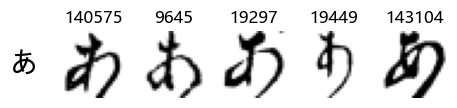
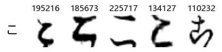
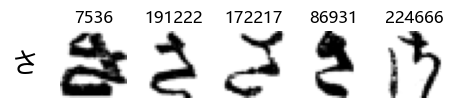
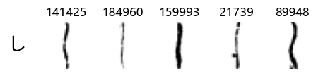
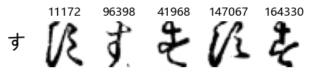
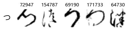
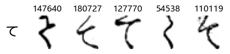
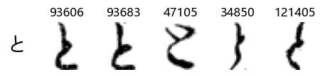
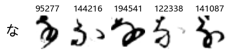
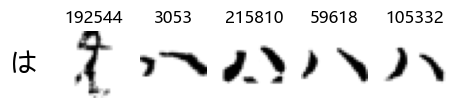
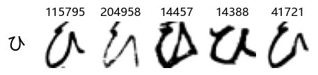
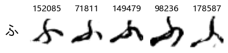
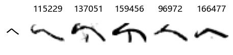
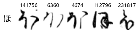
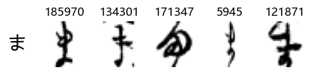
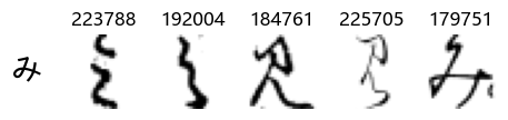
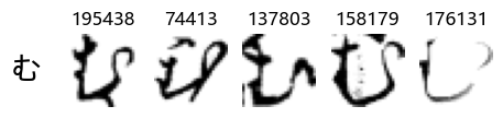
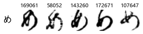
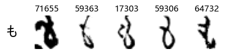
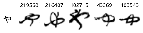
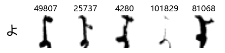
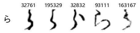
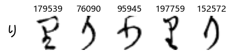
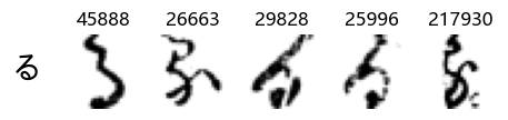
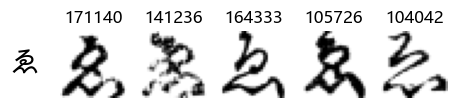
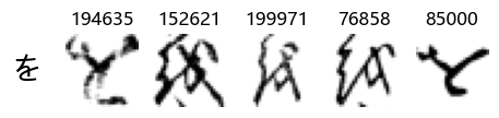
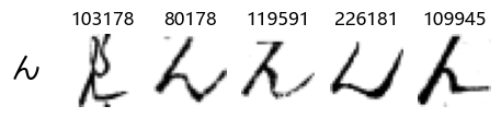
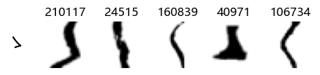
Now that we have the different characters in the class map, we can also take a look at more samples of the training data, this time per class. This is a little more involved, and requires some slicing and dicing of indices:
sample_size = 20

# for each class index
for i in classmap['index']:

    char = classmap.loc[i, 'char']

    # create an index of where the data are of that class
    char_index = np.where(y_train == i)[0]

    # randomly sample indices therefrom
    sample_index = np.random.choice(char_index, sample_size)

    fig, axes = plt.subplots(sample_size, 1, figsize=(sample_size, 1))

    # Iterate over of the sample images per class and add to the subplot grid
    for j in range(0, sample_size):
        plt.subplot(1, sample_size, j+1)
        plt.imshow(X_train[sample_index[j], :, :], cmap='gray_r')
        plt.title(str(sample_index[j]))
        plt.axis('off') # hide axes

    # Add label to the left
    fig.supylabel(char, fontsize=40, rotation=0, x=0.075)

    # show
    plt.show()


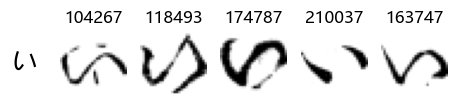
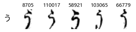
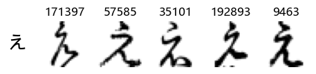
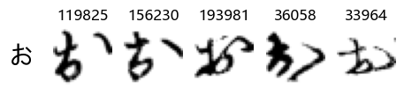
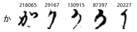
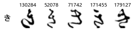
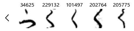
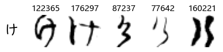
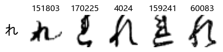
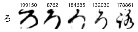
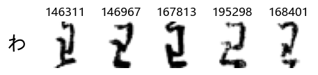
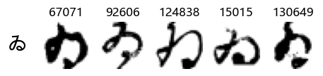
Whoa! That’s a lot of hiragana. Also, there appears to be a high degree of variability in how some of them are written… to the point where I wonder if some of these are not properly labelled.
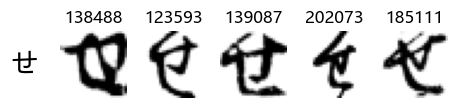
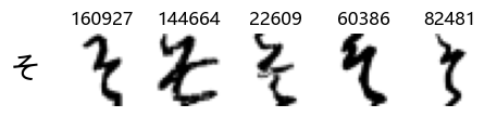
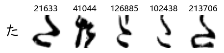
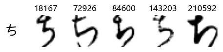
In particular, it’s interesting to note that “shi” (し) is mostly just written as a straight vertical line, omitting the bend. There is also a lot of variability in how some of the characters which may or may not be written as fully connected or have alternate depictions appear, in particular, in my Japanese class we learned that “ki” (き) and “sa” (さ) should be separated, whereas the font and depictions here have them fully connected as per alternate forms. Also most of the “ta” (た) appear to just be squiggles without fully lifting the pen.
Sorting out the above code was actually a fair bit of work, so we will wrap this in a function to use again:
def show_examples(X, y, sample_size = 20, font_size=40):

    for i in classmap['index']:

        char = classmap.loc[i, 'char']
        char_index = np.where(y == i)[0]
        sample_index = np.random.choice(char_index, sample_size)

        fig, axes = plt.subplots(sample_size, 1, figsize=(sample_size, 1))

        for j in range(0, sample_size):
            plt.subplot(1, sample_size, j+1)
            plt.imshow(X[sample_index[j], :, :], cmap='gray_r')
            plt.title(str(sample_index[j]))
            plt.axis('off') # hide axes

        fig.supylabel(char, fontsize=font_size, rotation=0, x=0.005*sample_size)
        plt.show()
# Check
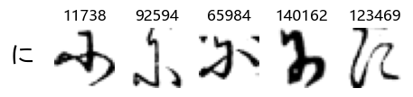
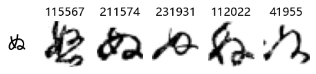
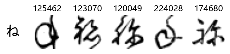
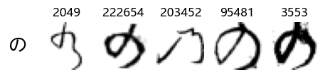
show_examples(X_train, y_train, sample_size=5, font_size=20)
Examining the test data
Now that we have taken a look at the training data (the data from which our models will learn), we can now do likewise for the test data - the dataset which our models will not have “seen” and will be finally evaluated against. Ideally, this should be qualitatively similar to the training data and have similar class (character) balance.
First, let’s load the data as we did with the training data:
# Load the data from numpy format
test_img = np.load('data/k49-test-imgs.npz')

# Check the shape of the stored array
print(train_img['arr_0'].shape)
print(test_img['arr_0'].shape)
(232365, 28, 28)
(38547, 28, 28)
Our training data has 232,365 images whereas our smaller test dataset is 38,547 images. The dataset comprises 270,912 images in total with a train/test split of ~86%/14%.
As before, we will pull out the data out into a numpy array, X_test:
X_test = test_img['arr_0']
# Check shape
X_test.shape
(38547, 28, 28)
Next, let’s take a look at the class balance for test and see if it is commensurate with the training set. Remember, there were a number of hiragana which were quite underrepresented.
We load the class labels for the test set as before we did for train:
test_labels = np.load('data/k49-test-labels.npz')
# Check
test_labels['arr_0'].shape
(38547,)
There are 38,547 test labels which matches with the dataset size of the test set, good. We’ll pull the test labels out into a pandas series as we did for train:
# Pull out the class labels into a pandas series
y_test = pd.Series(test_labels['arr_0'])

# Check
y_test.head()
0    19
1    23
2    10
3    31
4    26
dtype: uint8
Finally, we can check the class balance as before using the data and labels:
# Find the observation count per character and change the index to the characters from int class label
test_char_counts = y_test.map(classmap['char']).value_counts()

# Create a bar plot for only those with less than 6000 observations
test_filtered = test_char_counts[char_counts < 6000].sort_values()

test_filtered_pct = test_filtered/X_test.shape[0]*100.0

test_filtered_pct
ゑ    0.166031
ゐ    0.176408
え    0.326874
ゆ    0.674501
む    0.726386
ほ    0.840532
ぬ    0.871663
ろ    0.902794
わ    1.011752
ね    1.035100
ち    1.084390
み    1.291929
め    1.432018
ゝ    1.489091
そ    1.631774
せ    1.758892
け    1.989779
ひ    2.168781
dtype: float64
Now let’s put the original training proportions together with those for test to compare, and visualize:
class_pcts = pd.DataFrame({'train_pct':char_counts/X_train.shape[0], 'test_pct':test_char_counts/X_test.shape[0]})

class_pcts.sort_values(by='train_pct').plot(kind='bar', figsize=(10, 2))
plt.title('Class Proportions for Train and Test Sets')
plt.xlabel('Class (Hiragana Character)')
plt.tight_layout()
plt.ylabel('Proportion of Dataset')
plt.xticks(rotation=0)
plt.show()
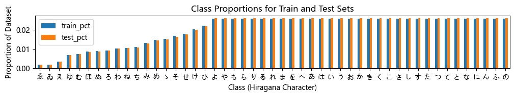
We can see above that the relative class proportions for the different characters are nearly identical for both the train and test sets. Therefore we should expect the training set to be representative of the overall class distribution and good for us to use. We will still expect it to be more difficult to classify the characters which have fewer observations from which to learn, here on the left had side of the graph up until Yo (よ).
Finally, we can also take a look at some examples of the test data, just to get an even better idea of how the different characters look in the data, as we saw before they are written quite differently from their representations in font.
We can now simply use our show_examples function we created previously to do this in a one-liner:
show_examples(X_test, y_test, font_size=20)


Again, we see a lot of variability, particularly in some characters that are drawn quite differently from their font representation. Notably, as before with Ta (た) and also Shi (し) which appears to perhaps have two different ways of writing it, and Ni (に) which is written more similarly to Yo (よ).
Conclusions
We’ve taken a good look at the dataset and what we’ll be working with going forward. Reassuringly, the proportions of the data are consistent across the train and test sets, but again, we’ll expect the model performance to vary considerably by class as some hiragana are underrepresented in the data.
Also, more generally speaking, from the samples we’ve looked at, there appears to be a high degree of variability and considerable differences in the way the hiragana are handwritten as opposed to their “official” representation, and that some are quite similar to other characters. As such, I would not be surprised if there will be pairs or sets of hiragana which a model will have greater difficulty differentiating between than others.
We will now proceed to part 2, and train a deep learning model to learn what patterns constitute the different characters, and be able to make predictions about which hiragana a given handwritten image may be.