
Mapping the Toronto Neighbourhoods with Geopandas and Folium
The full code can be found in the gitub repo: toronto_neighbourhoods
Introduction
A long time ago, this post appeared on my everyday analytics blog in 2016. Since then, the code in R no longer works, as Google Maps now requires an API key, and there have been some significant changes to both ggmap and the maptools / rgdal packages.
As such, I decided to revisit this. As it turns out, performing the same types of tasks now is actually much easier with geopandas. Interactive mapping with Folium, which creates Javascript-based Leaflet maps is a little trickier, and there are some good resources I relied on here to which I’ll also point back.
First, we will import the libraries we need:
import pandas as pd
import matplotlib.pyplot as plt
import geopandas
import folium
Luckily, I saved the original shapefiles and data in the github repo, as they no longer appear to be available at their original sources. Though I’m sure the same data is out there in many other places, I’ll use what’s saved there to make this a 1-1 reproduction of what was done in R as much as possible.
Static Choropleths using Geopandas
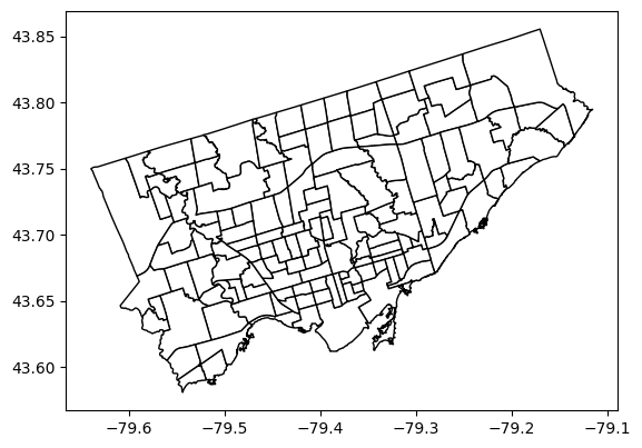
First, we’ll reproduce a simple plot of the neighbourhood boundaries for Toronto. We read the data into geopandas, just a we would into regular pandas if it were a csv:
gdf = geopandas.read_file("NEIGHBORHOODS_WGS84_2.shp")

gdf.head()
| AREA_S_CD | AREA_NAME | geometry | |
|---|---|---|---|
| 0 | 097 | Yonge-St.Clair (97) | POLYGON ((-79.39119 43.68108, -79.39141 43.680... |
| 1 | 027 | York University Heights (27) | POLYGON ((-79.50529 43.75987, -79.50488 43.759... |
| 2 | 038 | Lansing-Westgate (38) | POLYGON ((-79.43998 43.76156, -79.44004 43.761... |
| 3 | 031 | Yorkdale-Glen Park (31) | POLYGON ((-79.43969 43.70561, -79.44011 43.705... |
| 4 | 016 | Stonegate-Queensway (16) | POLYGON ((-79.49262 43.64744, -79.49277 43.647... |
The code for creating this visual is incredibly straightforward:
# Read the neighborhood shapefile data and plot
gdf.plot(color="white", edgecolor="black")
plt.show()
Next, adding the demographic data. This is read into pandas as it is just in a csv:
# Read the demographic data
demo = pd.read_csv("WB-Demographics.csv")
demo.head()
| Neighbourhood | Neighbourhood Id | Total Area | Total Population | Pop - Males | Pop - Females | Pop 0 - 4 years | Pop 5 - 9 years | Pop 10 - 14 years | Pop 15 -19 years | ... | Language - Chinese | Language - Italian | Language - Korean | Language - Persian (Farsi) | Language - Portuguese | Language - Russian | Language - Spanish | Language - Tagalog | Language - Tamil | Language - Urdu | |
|---|---|---|---|---|---|---|---|---|---|---|---|---|---|---|---|---|---|---|---|---|---|
| 0 | West Humber-Clairville | 1 | 30.09 | 34100 | 17095 | 17000 | 1865 | 1950 | 2155 | 2550 | ... | 475 | 925 | 95 | 160 | 205 | 15 | 1100 | 850 | 715 | 715 |
| 1 | Mount Olive-Silverstone-Jamestown | 2 | 4.60 | 32790 | 16015 | 16765 | 2575 | 2535 | 2555 | 2620 | ... | 275 | 750 | 60 | 350 | 115 | 50 | 820 | 345 | 1420 | 1075 |
| 2 | Thistletown-Beaumond Heights | 3 | 3.40 | 10140 | 4920 | 5225 | 575 | 580 | 670 | 675 | ... | 95 | 705 | 35 | 115 | 105 | 15 | 570 | 130 | 120 | 300 |
| 3 | Rexdale-Kipling | 4 | 2.50 | 10485 | 5035 | 5455 | 495 | 520 | 570 | 665 | ... | 95 | 475 | 30 | 95 | 145 | 30 | 700 | 180 | 70 | 215 |
| 4 | Elms-Old Rexdale | 5 | 2.90 | 9550 | 4615 | 4935 | 670 | 720 | 720 | 725 | ... | 90 | 510 | 55 | 285 | 80 | 30 | 670 | 195 | 60 | 140 |
5 rows × 39 columns
Now will merge the two on the neighbourhood id. In the original data this is the field AREA_S_CD, which was stored as a string, so we first convert to integer and then join the two dataframes:
# Convert neighborhood code to int for joining
gdf['AREA_S_CD'] = gdf['AREA_S_CD'].astype(int)

# Merge on Neighborhood ID
gdf2 = pd.merge(gdf, demo, left_on="AREA_S_CD", right_on="Neighbourhood Id")

gdf2.head()
| AREA_S_CD | AREA_NAME | geometry | Neighbourhood | Neighbourhood Id | Total Area | Total Population | Pop - Males | Pop - Females | Pop 0 - 4 years | ... | Language - Chinese | Language - Italian | Language - Korean | Language - Persian (Farsi) | Language - Portuguese | Language - Russian | Language - Spanish | Language - Tagalog | Language - Tamil | Language - Urdu | |
|---|---|---|---|---|---|---|---|---|---|---|---|---|---|---|---|---|---|---|---|---|---|
| 0 | 97 | Yonge-St.Clair (97) | POLYGON ((-79.39119 43.68108, -79.39141 43.680... | Yonge-St.Clair | 97 | 1.2 | 11655 | 5235 | 6420 | 395 | ... | 250 | 120 | 55 | 120 | 55 | 180 | 230 | 95 | 10 | 10 |
| 1 | 27 | York University Heights (27) | POLYGON ((-79.50529 43.75987, -79.50488 43.759... | York University Heights | 27 | 13.2 | 27715 | 13580 | 14125 | 1645 | ... | 1750 | 2280 | 265 | 370 | 285 | 430 | 1475 | 930 | 1175 | 580 |
| 2 | 38 | Lansing-Westgate (38) | POLYGON ((-79.43998 43.76156, -79.44004 43.761... | Lansing-Westgate | 38 | 5.4 | 14640 | 6950 | 7695 | 845 | ... | 995 | 165 | 580 | 630 | 90 | 770 | 320 | 460 | 15 | 45 |
| 3 | 31 | Yorkdale-Glen Park (31) | POLYGON ((-79.43969 43.70561, -79.44011 43.705... | Yorkdale-Glen Park | 31 | 5.9 | 14685 | 6750 | 7940 | 640 | ... | 640 | 2950 | 50 | 70 | 810 | 85 | 625 | 605 | 120 | 60 |
| 4 | 16 | Stonegate-Queensway (16) | POLYGON ((-79.49262 43.64744, -79.49277 43.647... | Stonegate-Queensway | 16 | 7.9 | 24690 | 11935 | 12745 | 1395 | ... | 330 | 755 | 135 | 65 | 555 | 635 | 455 | 260 | 25 | 35 |
5 rows × 42 columns
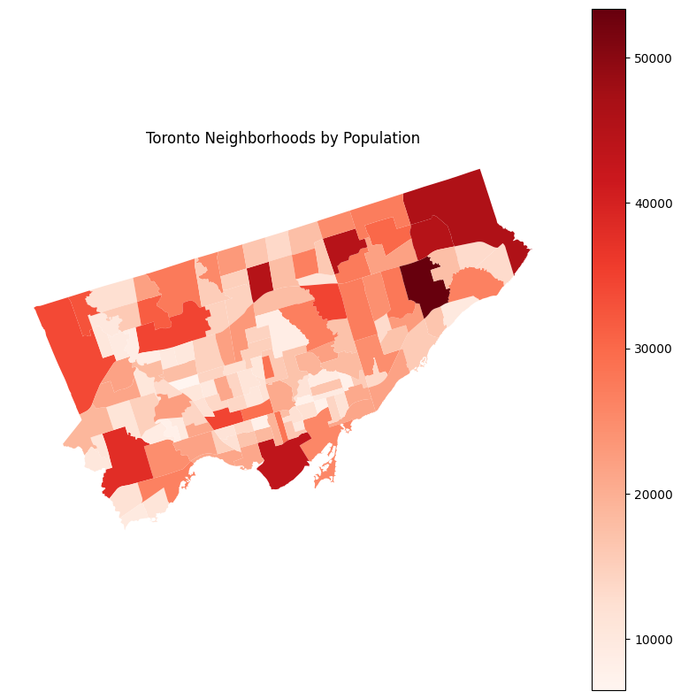
To create a static choropleth in geopandas, the call is, again, very straightforward - you only need add the field which is used for colour (here, Total Population).
gdf2.plot('Total Population', cmap='Reds', figsize=(10, 10), legend=True)
plt.axis('off')
plt.title('Toronto Neighborhoods by Population')
plt.show()
In my original post, I used RColorBrewer to create a spectral palette. There’s no need to do that here, as the spectral palette is built into matplotlib.
gdf2.plot('Total Population', cmap='Spectral_r', figsize=(10, 10), legend=True)
plt.axis('off')
plt.title('Toronto Neighborhoods by Population')
plt.show()
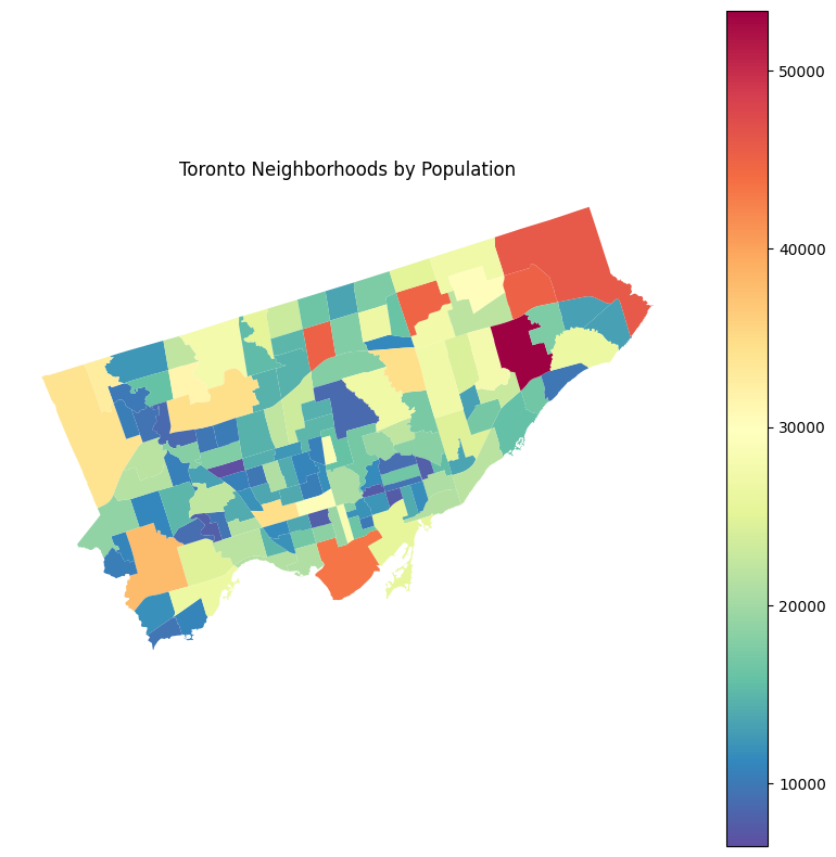
In retrospect, from a visualization perspective, I think the first visual is actually superior; the spectral palette should be avoided in general due to accessibility issues (i.e. for those who are colorblind) and in this particular case is a diverging palette when we are not comparing values around a meaningful central point. A sequential palette such as in the first visual would be the way to go.
Interactive Choropleth with Tooltips using Folium
In my original post, I used ggmap to create an interactive Google Map in R. Since then, as the github maintainer notes, it’s no longer possible to do so without an API key which requires a credit card and setting up as part of GCP.
Instead here, to reproduce the result we’ll be using Folium to create an interactive map in Leaflet.
First so the variable names play nice with Javascript, we’ll remove the spaces in the two we need:
# Rename variable names to remove spaces
demo = demo.rename(columns={'Neighbourhood Id':'neighbourhood_id', 'Total Population':'total_pop'})

demo.head()
| Neighbourhood | neighbourhood_id | Total Area | total_pop | Pop - Males | Pop - Females | Pop 0 - 4 years | Pop 5 - 9 years | Pop 10 - 14 years | Pop 15 -19 years | ... | Language - Chinese | Language - Italian | Language - Korean | Language - Persian (Farsi) | Language - Portuguese | Language - Russian | Language - Spanish | Language - Tagalog | Language - Tamil | Language - Urdu | |
|---|---|---|---|---|---|---|---|---|---|---|---|---|---|---|---|---|---|---|---|---|---|
| 0 | West Humber-Clairville | 1 | 30.09 | 34100 | 17095 | 17000 | 1865 | 1950 | 2155 | 2550 | ... | 475 | 925 | 95 | 160 | 205 | 15 | 1100 | 850 | 715 | 715 |
| 1 | Mount Olive-Silverstone-Jamestown | 2 | 4.60 | 32790 | 16015 | 16765 | 2575 | 2535 | 2555 | 2620 | ... | 275 | 750 | 60 | 350 | 115 | 50 | 820 | 345 | 1420 | 1075 |
| 2 | Thistletown-Beaumond Heights | 3 | 3.40 | 10140 | 4920 | 5225 | 575 | 580 | 670 | 675 | ... | 95 | 705 | 35 | 115 | 105 | 15 | 570 | 130 | 120 | 300 |
| 3 | Rexdale-Kipling | 4 | 2.50 | 10485 | 5035 | 5455 | 495 | 520 | 570 | 665 | ... | 95 | 475 | 30 | 95 | 145 | 30 | 700 | 180 | 70 | 215 |
| 4 | Elms-Old Rexdale | 5 | 2.90 | 9550 | 4615 | 4935 | 670 | 720 | 720 | 725 | ... | 90 | 510 | 55 | 285 | 80 | 30 | 670 | 195 | 60 | 140 |
5 rows × 39 columns
Next we’ll create the map. Creating a choropleth map with no interactivity is actually fairly straightforward. Adding interactivity is a little more involved. There are some good resources on this here:
- Interactive choropleth with Python and Folium (and some tips) by Amodiovalerio Verde
- Hong Kong Voter Distribution by Carrie Lo and Yeung Wong
I found the latter of the two to be simpler and so went with their approach for adding tooltips. First we need to create a new column in the geopandas dataframe with the strings to appear in the tooltip. I’ll do this using apply and a lambda function to join the Neighbourhood and Total Population columns:
# Prepare tooltip - combination of neighbourhood and population columns in a string
gdf2['tooltip'] = gdf2.apply(lambda x: x['Neighbourhood'] + ' ' + str(x['Total Population']), axis=1)

# Check
gdf2['tooltip'].head()
0             Yonge-St.Clair 11655
1    York University Heights 27715
2           Lansing-Westgate 14640
3         Yorkdale-Glen Park 14685
4        Stonegate-Queensway 24690
Name: tooltip, dtype: object
Then we create the map, add the choropleth layer, and finally update the layer by adding the tooltip:
# Base map
tdot_map = folium.Map(location=[43.7, -79.4], zoom_start=11)

# Choropleth
choropleth = folium.Choropleth(geo_data=gdf2,
                  data=demo,
                  columns=['neighbourhood_id', 'total_pop'],
                  key_on="feature.properties.AREA_S_CD",).add_to(tdot_map)

# Add tooltip
folium.LayerControl().add_to(tdot_map)
choropleth.geojson.add_child(
    folium.features.GeoJsonTooltip(['tooltip'], labels=False)
)

tdot_map
And that’s it! A beautiful interactive web-based map with just a little python.
I’ve added this content back to the original github repo, check out the code if you are interested.