
Kuzushiji-49: An Introduction to CNNs
Part 2: Image Classification with CNNs in Keras
The full code can be found in the gitub repo: Kuzushiji-49-CNN
Introduction
Now that we have explored the data and verified some assumptions, we will proceed in Part 2 to apply deep learning models for the purposes of image classification.
In this notebook we will be using Keras, which has been integrated into the Tensorflow deep learning framework proper since Version 2.0.
Because we will doing deep learning which is computationally expensive, we will also be leveraging the free GPU computing available from Google Colab. This will require some additional steps to move the data from local into the cloud (Google Drive) and also some additional code for rendering the hiragana in plots which differs from on my local machine. We will address these points as they arise in the workflow.
Before diving into the code and training the models, I will also take some time to briefly introduce and discuss the fundamentals of deep learning for computer vision at a high level.
As always, first we will load the regular core libraries of the data science stack:
# holy trinity
import numpy as np
import pandas as pd
import matplotlib.pyplot as plt
Loading the Data
As mentioned above, the data needed to be moved into the cloud in order to be read in Colab. Since the number of files and their sizes are relatively small, I simply uploaded these through the browser.
After this, we can mount Google Drive as a folder on the virtual machine backing the Colab notebook:
from google.colab import drive
drive.mount('/content/drive/')
The files in Google Drive are now available in the filesystem of the virtual machine backing the Colab notebook at /content/drive/MyDrive. Let’s just quickly check that all the data files are there by running a bash command using !:
!ls drive/MyDrive/kuzushiji/data/
k49_classmap.csv   k49-test-labels.npz	k49-train-labels.npz
k49-test-imgs.npz  k49-train-imgs.npz
Great, the files are there, so we can go ahead and load them all together in one cell:
# Reload the data

# Train
X_train = np.load('drive/MyDrive/kuzushiji/data/k49-train-imgs.npz')['arr_0']
y_train = np.load('drive/MyDrive/kuzushiji/data/k49-train-labels.npz')['arr_0']

# Test
X_test = np.load('drive/MyDrive/kuzushiji/data/k49-test-imgs.npz')['arr_0']
y_test = np.load('drive/MyDrive/kuzushiji/data/k49-test-labels.npz')['arr_0']

# Classmap
classmap = pd.read_csv('drive/MyDrive/kuzushiji/data/k49_classmap.csv')
Adding a font for Japanese characters in Colab
Unfortunately, simply using the code which worked locally for displaying the hiragana will not work here, and this requires a little more doing. I followed the excellent guide here: Using external fonts in Google Colaboratory. This follows a very similar procedure to the references pointed to in Part 1, through creating a FontProperties object in matplotlib, and then passing it to plotting / annotation / axis labeling / etc. calls where required.
For rendering Japanese characters, we’ll be using Noto Sans Japanese from Google Fonts.
# Download the fonts and move to the user font directory
!yes | wget https://fonts.google.com/download?family=Noto%20Sans%20JP -O Noto_Sans_JP.zip
!unzip Noto_Sans_JP.zip
!mv *.otf /usr/share/fonts/truetype/
# Verify below with a sample plot
import matplotlib as mpl
import matplotlib.pyplot as plt
import matplotlib.font_manager as fm
# Create FontProperties object using the file
path = '/usr/share/fonts/truetype/NotoSansJP-Regular.otf'
fontprop = fm.FontProperties(fname=path)
# Test
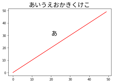
plt.plot(range(50), range(50), 'r')
plt.title('あいうえおかきくけこ', fontproperties=fontprop, fontsize=20)
plt.annotate('あ', (20, 30), fontproperties=fontprop, fontsize=20)
plt.show()
--2023-02-15 00:42:36--  https://fonts.google.com/download?family=Noto%20Sans%20JP
Resolving fonts.google.com (fonts.google.com)... 172.253.118.113, 172.253.118.139, 172.253.118.100, ...
Connecting to fonts.google.com (fonts.google.com)|172.253.118.113|:443... connected.
HTTP request sent, awaiting response... 200 OK
Length: unspecified [application/zip]
Saving to: ‘Noto_Sans_JP.zip’

Noto_Sans_JP.zip        [   <=>              ]  22.35M  42.6MB/s    in 0.5s

2023-02-15 00:42:39 (42.6 MB/s) - ‘Noto_Sans_JP.zip’ saved [23439995]

Archive:  Noto_Sans_JP.zip
replace OFL.txt? [y]es, [n]o, [A]ll, [N]one, [r]ename: y
  inflating: OFL.txt
  inflating: NotoSansJP-Thin.otf
  inflating: NotoSansJP-Light.otf
  inflating: NotoSansJP-Regular.otf
  inflating: NotoSansJP-Medium.otf
  inflating: NotoSansJP-Bold.otf
  inflating: NotoSansJP-Black.otf
Fundamentals of Deep Learning
Before we start building our deep learning model - a Convolution Neural Network, or CNN - I will introduce some of the fundamental concepts of machine learning and building blocks of how neural networks work.
First we must talk about what the goals of building a predictive model in supervised learning are: to make a prediction about the target (whether that be a class label or a continuous value) and minimize the error (or, in a deep learning practitioner’s parlance, the loss) in doing so.
In the case of simple linear models, this translates to an optimization problem where the goal is to find the model parameters or coefficients which minimize the loss - this is what the “learning” in machine learning is - the model is learning the parameters which will minimize the error of its predictions over the whole of the training data.
For a simple linear model for classification, were the goal is to predict the probability of the class label between 0 and 1, this takes the form of a Logistic Regression - a special function called the sigmoid functions is applied to a linear combination of our \(x\) variables and also includes an intercept, \(\beta_0\) and coefficients which must be learned, in the vector \(\beta\):
\[\hat{y} = f(x) = \frac{1}{1 + e^{-(\beta_0 + \beta X})}\]The end result for each observation of the values for the input variables (all the \(x_i\) which make up \(X\)) is a value between 0 and 1, output as our \(\hat{y}\). This is then typically rounded up from a probability cutoff (threshold) to make what is known as a hard prediction, that of the class label; so for observations where \(\hat{y} \lt 0.5\) the model would predict the observation to be of class 0, and for \(\hat{y} \geq 0.5\) it would predict class 1.
In deep learning, many models are combined together in different layers and the outputs of previous layers are used as inputs for the next layer. Each model which makes up the different layers in the network is referred to as a node.
The first layer in the model, called the input layer, is just a layer to take in the data. The final layer in the model, called the output layer, is the end result of all of the calculations from across the layers in-between - referred to as the hidden layers - into our final prediction, \(\hat{y}\).
Now, instead of learning the same number of coefficients for the model as there are input features \(x_i\), each node will have its own set of coefficients (or in deep learning speak, weights) based upon the outputs of the previous layer.
The number of layers used and nodes present in each - collectively, making up what is referred to as the model architecture - is up to the modeller.
Given this, the number of coefficients in a deep learning model tends to grow very large; it is not unusual for neural networks to have millions of weights. This is from where much of the predictive power of artifical neural network arises. It also comes at a price, as finding the optimal values for such a large number of weights to minimize the error - or loss - now becomes a very computationally challenging problem.
In the Logistic Regression model as described above, a special sigmoid function is applied to the linear combination of inputs and coefficients. Furthermore adding to the computational complexity, in a deep learning model each layer can have a different function - referred to as the activation function - applied to the outputs of each node, which is also a combination of the inputs from the previous layer multiplied by the weights plus a bias term (intercept). It is from the application of these activation functions where the highly non-linear nature of neural networks arises, and this is also what gives them such predictive power, in addition to the very large number of weights as noted above.
In practice, there are fairly well established model architectures and families of activation functions which through research have been found to perform well for different types of machine learning problems.
In what follows, we will apply a basic convolution neural network architecture similar to that below:
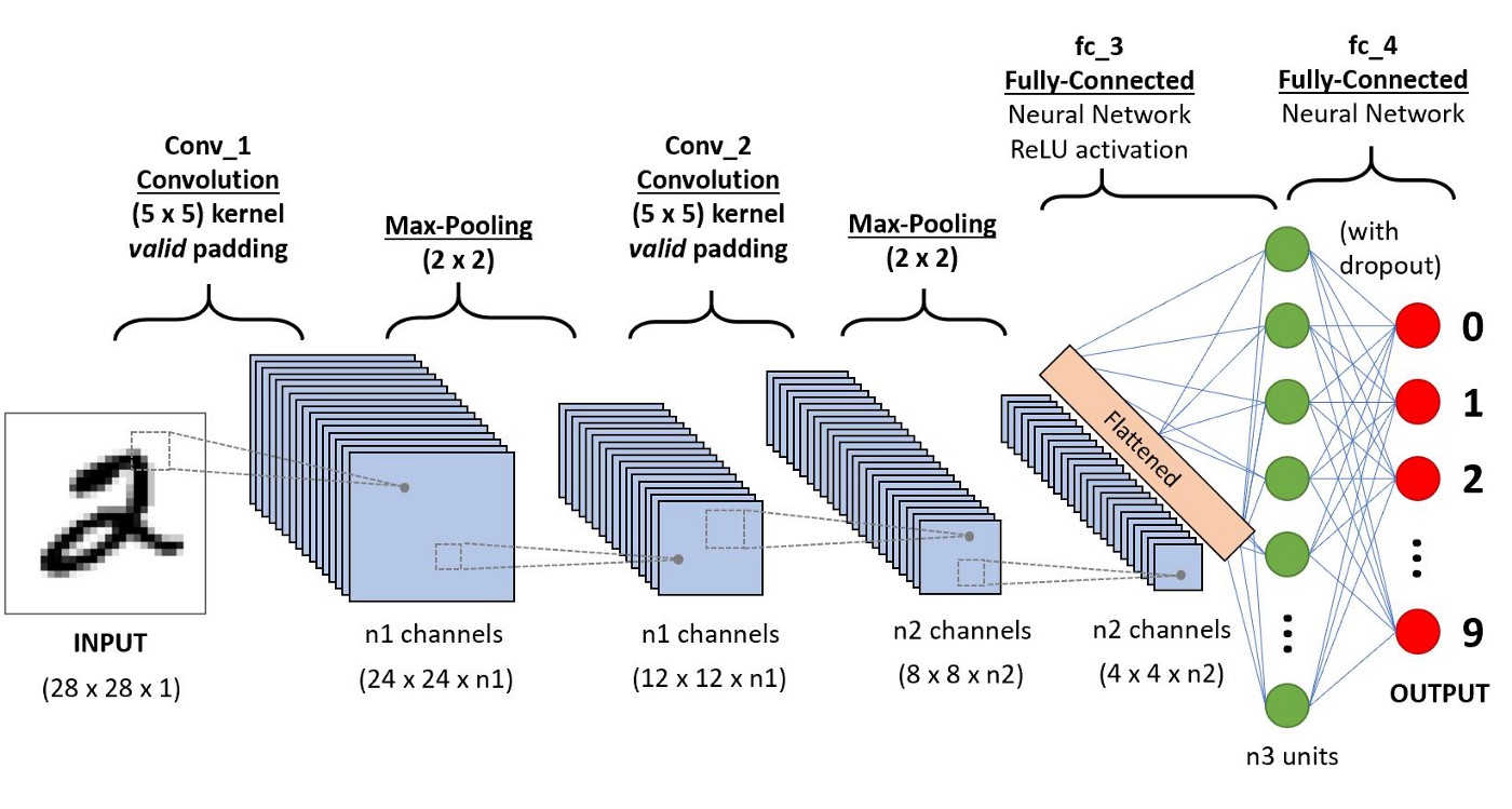
Image source: A Comprehensive Guide to Convolutional Neural Networks — the ELI5 way
In the case for using image data, our input features to the network are simply the pixel values, which in black and white on a computer are represented as integers from 0-255. We can see on the right hand side, the fully-connected part of the network which is the same as what was discussed above.
Additionally, in a CNN architecture, there are special types of layers specifically designed for multi-dimensional data for two (black & white images) or three (for colour images) dimensions. These two types of layers are convolutional layers, which give the network its name, and max pooling layers.
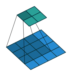
The convolution layer works by sliding a kernel - which you can think of as a type of filter - over the image and multiplying each value (weight) in the kernel by the images in the pixel. Depending on the size of the kernel and the values, the result will have different dimensions - usually smaller - than the original image. You can read more on this here. This is nicely visualized in the figure below by Vincent Dumoulin from Google Brain below - the blue are the input pixels, and the cyan the output after applying a convolution:
What are the values in the kernel? They are learned as part of the training of the network to minimize the loss, just as the weights in other layers are. Furthermore, in most modern architectures, a single kernel (filter) is not learned per layer but a “stack” of many.
The other type of layer specifically for multi-dimensional data that functions similarly is a max pooling layer, which is also “slid” over the image’s pixel values. Here, unlike a convolutional layer, a kernel is not used but the max value in the window is taken. This is visualized in the animation below, with 2x2 max pooling applied to a 4x4 input. As such, applying max pooling results in an output smaller than the input. There are also other types of pooling layers but these are less commonly used.
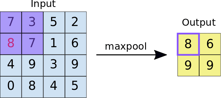
Image source: https://nico-curti.github.io/NumPyNet/NumPyNet/layers/maxpool_layer.html
Now that we have covered some of the fundamentals, we can proceed to applying these in code in Tensorflow and training a model for the hiragana.
Modeling
First we will import the Sequential model type and the different layer types we’ll need for our model from Tensorflow:
from tensorflow.keras import Sequential
from tensorflow.keras.layers import Input, Dense, Conv2D, MaxPooling2D, Flatten, Dropout
Building a Neural Network
When working with any type of machine learning, there are generally three steps to the workflow:
- Create the model
- Train the model
- Evaluate the model
For deep learning, in Step #1, this is where are generally concerned with the structure of the network we want to craft (the model architecture).
To get started, we are going to build a very simple CNN - in fact one I would call a ‘toy’ model. This is very similar to what appears in the Tensorflow CNN tutorial, and is simply composed of 2 convolutional layer with max pooling layers in between, and one dense / fully-connected layer after flattening. The first convolutional layer will learn 32 kernels of size 3x3 and the second 64 of the same dimension.
Creating the Model
First, we need to check the input shape of our data, in order to construct the correct dimension for the input layer:
input_shape = X_train.shape
print(input_shape)
(232365, 28, 28)
Great, next we will create the model object. In Tensorflow the vast majority of deep learning models (including CNNs) which flow from left to right are in the Sequential class:
ks_model = Sequential()
Now we can set up the model architecture. We do this using the Conv2D, MaxPooling2D, Flatten, and Dense layer types from Tensorflow. For our network, we will just be using regular ReLU as our activation function.
ks_model.add(Input(shape=(28, 28, 1)))
ks_model.add(Conv2D(32, kernel_size=(3, 3), activation="relu"))
ks_model.add(MaxPooling2D(pool_size=(2, 2)))
ks_model.add(Conv2D(64, kernel_size=(3, 3), activation="relu"))
ks_model.add(MaxPooling2D(pool_size=(2, 2)))
ks_model.add(Flatten())
ks_model.add(Dense(49, activation="softmax"))
Finally, we need to compile our model, which necessitates attaching a loss - a measure of how wrong we are / the error metric for the model; an optimizer - which, for the purposes of our discussion, is a numerical solver used to train the model; and metrics - to measure our model’s performance. Here since we are doing a classification problem, we’ll be using categorical cross-entropy as our loss and accuracy as our metric. The adam optimizer is fairly standard and performs well:
ks_model.compile(loss="sparse_categorical_crossentropy", optimizer="adam", metrics=["accuracy"])
Now that we’ve compiled the model, we can have Tensorflow summarize the model architecture for us, which includes a high-level overview of the model, as well as some calculations on the number of model parameters (weights):
ks_model.summary()
Model: "sequential"
_________________________________________________________________
 Layer (type)                Output Shape              Param #
=================================================================
 conv2d (Conv2D)             (None, 26, 26, 32)        320

 max_pooling2d (MaxPooling2D  (None, 13, 13, 32)       0
 )

 conv2d_1 (Conv2D)           (None, 11, 11, 64)        18496

 max_pooling2d_1 (MaxPooling  (None, 5, 5, 64)         0
 2D)

 flatten (Flatten)           (None, 1600)              0

 dense (Dense)               (None, 49)                78449

=================================================================
Total params: 97,265
Trainable params: 97,265
Non-trainable params: 0
_________________________________________________________________
We can see here for our model, there 97,265 model parameters to be learned! Again, deep learning models can get quite large, and it is common for them to have millions of parameters. We can now proceed to training the model.
Training the Model
Now that are model is initialized, we are ready to train the model. In Keras / Tensorflow, this is a simple as calling model.fit().
Deep learning models are trained in epochs, where small batches of data are fed to the model at a time. Over each epoch, the weights are updated to reduce the loss (error). At the end of each epoch, the model will have seen every observation in the training set.
The results of the model training - including the performance for each epoch, which is what we are interested in - are saved in a history object. We will also specify the validation_split parameter, which is the percentage of data set aside from the training set to evaluate our model performance against in each epoch (i.e. the model is not being fit with this data, only evaluated against it).
Here we will train our model for 10 epochs with a validation set of 30%:
history = ks_model.fit(X_train, y_train, epochs=10, validation_split=0.3)
Epoch 1/10
5083/5083 [==============================] - 29s 5ms/step - loss: 0.6954 - accuracy: 0.8279 - val_loss: 0.3970 - val_accuracy: 0.8925
Epoch 2/10
5083/5083 [==============================] - 25s 5ms/step - loss: 0.3423 - accuracy: 0.9048 - val_loss: 0.3566 - val_accuracy: 0.9019
Epoch 3/10
5083/5083 [==============================] - 25s 5ms/step - loss: 0.2813 - accuracy: 0.9204 - val_loss: 0.3062 - val_accuracy: 0.9175
Epoch 4/10
5083/5083 [==============================] - 25s 5ms/step - loss: 0.2432 - accuracy: 0.9305 - val_loss: 0.3097 - val_accuracy: 0.9179
Epoch 5/10
5083/5083 [==============================] - 30s 6ms/step - loss: 0.2180 - accuracy: 0.9377 - val_loss: 0.2884 - val_accuracy: 0.9247
Epoch 6/10
5083/5083 [==============================] - 25s 5ms/step - loss: 0.1993 - accuracy: 0.9422 - val_loss: 0.3297 - val_accuracy: 0.9143
Epoch 7/10
5083/5083 [==============================] - 25s 5ms/step - loss: 0.1869 - accuracy: 0.9455 - val_loss: 0.3185 - val_accuracy: 0.9191
Epoch 8/10
5083/5083 [==============================] - 26s 5ms/step - loss: 0.1767 - accuracy: 0.9477 - val_loss: 0.3155 - val_accuracy: 0.9264
Epoch 9/10
5083/5083 [==============================] - 30s 6ms/step - loss: 0.1655 - accuracy: 0.9511 - val_loss: 0.3362 - val_accuracy: 0.9221
Epoch 10/10
5083/5083 [==============================] - 25s 5ms/step - loss: 0.1581 - accuracy: 0.9530 - val_loss: 0.3306 - val_accuracy: 0.9220
Using the GPU power of Colab, each epoch of training only took about 30 seconds. We can also see that the model accuracy is quite high - at the end of training it appears we are able to correctly classify the hiragana with over 95% accuracy! We should dig deeper here…
We can see the history object contains both the loss and accuracy for both the training data and the validation data:
history.history.keys()
dict_keys(['loss', 'accuracy', 'val_loss', 'val_accuracy'])
Now let’s plot the learning curves to see how the model performance evolved over the course of training, both when evaluated against the training data (the data the model has already seen) and the data which was set aside (the validation set):
epochs = np.arange(10) + 1

plt.subplots(1,2, figsize=(10, 5))

# Accuracy plot
plt.subplot(1,2,1)
plt.plot(epochs, history.history['accuracy'], marker='.', label='training')
plt.plot(epochs, history.history['val_accuracy'], marker='.', label='validation')
plt.xlabel('Epoch of training')
plt.ylabel('Accuracy')
plt.xticks(epochs)
plt.legend()

# Loss plot
plt.subplot(1,2,2)
plt.plot(epochs, history.history['loss'], marker='.', label='training')
plt.plot(epochs, history.history['val_loss'], marker='.', label='validation')
plt.xlabel('Epoch of training')
plt.ylabel('Loss')
plt.xticks(epochs)
plt.legend()

plt.suptitle('Learning Curves for Kuzushiji-49 CNN #2')
plt.show()
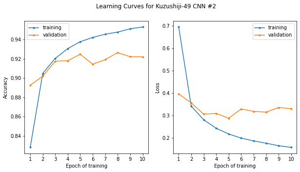
Hmm, well there’s good news and bad news. The good news is, as we noted before, that our model appears to be over 95% accurate. The bad news is that performance was attained only after a few epochs of training. We can see that for epochs ~4-10, the training performance increases, however the validation performance (the performance of the model on data it has not seen) does not appear to improve; in fact, looking at the loss on the right, if anything it appears it may even be getting worse.
This is a hallmark case of overfitting, the bane of the machine learning practitioner’s existence. The model is learning the particulars of the data it is seeing (being trained upon), not the overall patterns that make up the underlying phenomena, in this case, how the hiragana are drawn.
To combat this, we will introduce a neural network technique called dropout - here some of the nodes are randomly “switched off” during training - research has shown that this is an effective way to reduce overfitting in neural networks, or put another way, is a valid method for applying regularization (generally speaking, any changes made to way the model training occurs to reduce overfitting).
In Tensorflow, this is implemented as a type of layer which randomly sets a proportion of the outputs of the previous layer to zero, which is equivalent to the previous layer having those weights set to zero, or those nodes “switched off”.
We can now update our model architecture to include dropout, and hopefully this should help with the overfitting. We will apply a dropout of 30% to each convolutional layer, which will randomly switch off 30% of the weights at each step in training:
ks_model = Sequential()

ks_model.add(Input(shape=(28, 28, 1)))
ks_model.add(Conv2D(32, kernel_size=(3, 3), activation="relu"))
ks_model.add(Dropout(0.3))
ks_model.add(MaxPooling2D(pool_size=(2, 2)))
ks_model.add(Conv2D(64, kernel_size=(3, 3), activation="relu"))
ks_model.add(Dropout(0.3))
ks_model.add(MaxPooling2D(pool_size=(2, 2)))
ks_model.add(Flatten())
ks_model.add(Dense(49, activation="softmax"))

ks_model.compile(loss="sparse_categorical_crossentropy", optimizer="adam", metrics=["accuracy"])

ks_model.summary()
Model: "sequential_1"
_________________________________________________________________
 Layer (type)                Output Shape              Param #
=================================================================
 conv2d_2 (Conv2D)           (None, 26, 26, 32)        320

 dropout (Dropout)           (None, 26, 26, 32)        0

 max_pooling2d_2 (MaxPooling  (None, 13, 13, 32)       0
 2D)

 conv2d_3 (Conv2D)           (None, 11, 11, 64)        18496

 dropout_1 (Dropout)         (None, 11, 11, 64)        0

 max_pooling2d_3 (MaxPooling  (None, 5, 5, 64)         0
 2D)

 flatten_1 (Flatten)         (None, 1600)              0

 dense_1 (Dense)             (None, 49)                78449

=================================================================
Total params: 97,265
Trainable params: 97,265
Non-trainable params: 0
_________________________________________________________________
Now we can train the model again from the start with dropout added:
history = ks_model.fit(X_train, y_train, epochs=10, validation_split=0.3)
Epoch 1/10
5083/5083 [==============================] - 32s 6ms/step - loss: 0.9988 - accuracy: 0.7698 - val_loss: 0.4866 - val_accuracy: 0.8818
Epoch 2/10
5083/5083 [==============================] - 26s 5ms/step - loss: 0.4627 - accuracy: 0.8718 - val_loss: 0.3923 - val_accuracy: 0.9034
Epoch 3/10
5083/5083 [==============================] - 26s 5ms/step - loss: 0.3969 - accuracy: 0.8890 - val_loss: 0.3730 - val_accuracy: 0.9100
Epoch 4/10
5083/5083 [==============================] - 27s 5ms/step - loss: 0.3726 - accuracy: 0.8956 - val_loss: 0.3404 - val_accuracy: 0.9144
Epoch 5/10
5083/5083 [==============================] - 26s 5ms/step - loss: 0.3547 - accuracy: 0.8994 - val_loss: 0.3540 - val_accuracy: 0.9081
Epoch 6/10
5083/5083 [==============================] - 26s 5ms/step - loss: 0.3457 - accuracy: 0.9026 - val_loss: 0.3093 - val_accuracy: 0.9202
Epoch 7/10
5083/5083 [==============================] - 31s 6ms/step - loss: 0.3343 - accuracy: 0.9053 - val_loss: 0.3225 - val_accuracy: 0.9184
Epoch 8/10
5083/5083 [==============================] - 26s 5ms/step - loss: 0.3255 - accuracy: 0.9070 - val_loss: 0.2982 - val_accuracy: 0.9254
Epoch 9/10
5083/5083 [==============================] - 26s 5ms/step - loss: 0.3216 - accuracy: 0.9090 - val_loss: 0.3151 - val_accuracy: 0.9185
Epoch 10/10
5083/5083 [==============================] - 26s 5ms/step - loss: 0.3175 - accuracy: 0.9102 - val_loss: 0.3024 - val_accuracy: 0.9211
And plot the learning curves for the new model with regularization applied:
epochs = np.arange(10) + 1

plt.subplots(1,2, figsize=(10, 5))

# Accuracy plot
plt.subplot(1,2,1)
plt.plot(epochs, history.history['accuracy'], marker='.', label='training')
plt.plot(epochs, history.history['val_accuracy'], marker='.', label='validation')
plt.xlabel('Epoch of training')
plt.ylabel('Accuracy')
plt.xticks(epochs)
plt.legend()

# Loss plot
plt.subplot(1,2,2)
plt.plot(epochs, history.history['loss'], marker='.', label='training')
plt.plot(epochs, history.history['val_loss'], marker='.', label='validation')
plt.xlabel('Epoch of training')
plt.ylabel('Loss')
plt.xticks(epochs)
plt.legend()

plt.suptitle('Learning Curves for Kuzushiji-49 CNN #2')
plt.show()
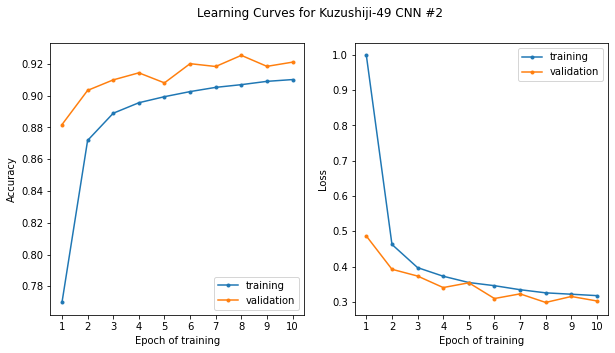
Here now with dropout added, we see that the validation score is actually higher than the training score and the error (loss) lower. There are a number of reasons for this. The important thing is that the training and validation scores are now tracking together.
The validation scores actually closely follow the gradual improvement we saw initially (even with the model overfitting on the training data), gradually improving from about 88% to around 92%. I am getting to the point where I am ready to say “good enough” for this simple illustration and our problem. That being said, there are benchmark scores with more advanced architectures for Kuzushiji-49 as high as 97.3%. We are still beating the benchmark Keras CNN score listed there, however, of ~89.4%. Again, we should bear in mind however, that this is the score on the validation set and not the test set.
Now we will evaluate our model performance and perform some further analysis in the following section.
Evaluating Model Performance
Now that we have trained a model which is “good enough” to make predictions, we will more formally evaluate the model performance on the test set. First, we will make predictions based on the input data in the test set, X_test:
y_proba = ks_model.predict(X_test)
1205/1205 [==============================] - 2s 2ms/step
Tensorflow’s default prediction behavior is to return an m by n matrix, where m is the number of observations in the data, and n is the number of classes. Each element (i, j) in the prediction matrix contains the model’s predicted likelihood that the data at index i belongs in class j. For us, the rows therefore correspond to all the images in the test set, and the columns to the classes, 0-48 of the hiragana. We can see this by looking at the shape of the output:
y_proba.shape
(38547, 49)
To convert each soft prediction (a probability from 0-1) to a hard prediction (integer class label 0-48), we can use the argmax function to find the class with the highest probability by applying this along the columns (axis 1). Now we will get back a one dimensional array with the same number of elements as the data in our test set, with the corresponding mostly likely class label prediction for each.
y_pred = y_proba.argmax(axis=1)

# Check
y_pred
array([19, 23, 10, ..., 1, 22, 47])
Now we can evaluate our model predictions on the test set, first overall, and then see if there are some hiragana which the model is able to more accurately predict as opposed to others (per-class performance). First we will take a look at the overall accuracy:
from sklearn.metrics import accuracy_score, confusion_matrix, classification_report

accuracy_score(y_test, y_pred)
0.8605598360443095
The model accuracy is about 86%. This is lower than what we saw during the model training on the validation set (~92%) which is to be expected, and pretty closely matches the basic Keras CNN benchmark as noted before (as this is pretty much what we reproduced here).
We can now go further and look at the model performance on a per-class basis. To do this, we use the classification report from scikit-learn:
print(classification_report(y_test, y_pred))
              precision    recall  f1-score   support

           0       0.89      0.89      0.89      1000
           1       0.96      0.94      0.95      1000
           2       0.90      0.94      0.92      1000
           3       0.81      0.83      0.82       126
           4       0.89      0.90      0.89      1000
           5       0.86      0.80      0.83      1000
           6       0.88      0.83      0.85      1000
           7       0.84      0.87      0.86      1000
           8       0.71      0.75      0.73       767
           9       0.87      0.88      0.87      1000
          10       0.93      0.83      0.88      1000
          11       0.97      0.83      0.89      1000
          12       0.89      0.77      0.82      1000
          13       0.91      0.69      0.78       678
          14       0.78      0.74      0.76       629
          15       0.82      0.85      0.84      1000
          16       0.91      0.94      0.93       418
          17       0.81      0.89      0.85      1000
          18       0.85      0.91      0.88      1000
          19       0.90      0.89      0.89      1000
          20       0.73      0.85      0.78      1000
          21       0.91      0.82      0.86      1000
          22       0.77      0.88      0.82       336
          23       0.83      0.86      0.85       399
          24       0.85      0.86      0.86      1000
          25       0.92      0.82      0.87      1000
          26       0.96      0.91      0.93       836
          27       0.90      0.86      0.88      1000
          28       0.95      0.88      0.91      1000
          29       0.81      0.77      0.79       324
          30       0.74      0.89      0.81      1000
          31       0.74      0.85      0.79       498
          32       0.90      0.86      0.88       280
          33       0.86      0.88      0.87       552
          34       0.84      0.89      0.87      1000
          35       0.87      0.83      0.85      1000
          36       0.85      0.89      0.87       260
          37       0.94      0.96      0.95      1000
          38       0.85      0.90      0.88      1000
          39       0.80      0.88      0.84      1000
          40       0.77      0.77      0.77      1000
          41       0.88      0.87      0.88      1000
          42       0.83      0.91      0.87       348
          43       0.92      0.81      0.86       390
          44       0.73      0.72      0.73        68
          45       0.79      0.84      0.82        64
          46       0.82      0.92      0.87      1000
          47       0.97      0.96      0.97      1000
          48       0.87      0.75      0.80       574

    accuracy                           0.86     38547
   macro avg       0.86      0.85      0.85     38547
weighted avg       0.86      0.86      0.86     38547
That’s a lot of information to take in! The classification report contains several metrics, both on a per-class basis and overall:
- Precision: This is what percentage of the predictions the model made to be in a given class are correct. That is, out of all the predictions the model made to be in class \(c\), what proportion were truly in class \(c\)?
- Recall: This is what percentage of observations of a given class the model correctly captured. That is, out of all the data which were truly in class \(c\), what proportion did the model correctly predict to be in class \(c\)?
- F1 Score: This is the harmonic mean of precision and recall, and serves to balance the two, as there is always a tradeoff between precision and recall.
- Support: The number of observations per class. We can see that the scores are generally lower for those hiragana with less observations in the test set which is reflective of their relative proportions in the training data.
The last 3 rows give the accuracy and the overall averages. We can see that precision, recall, F1, and accuracy are all around ~86% overall.
By default, sklearn returns a string which is suitable for printing out formatted as a table as we did above. Let’s instead return the output as a dictionary such that we can plunk it into a dataframe and visualize the results:
class_report = classification_report(y_test, y_pred, output_dict=True)

report_df = pd.DataFrame(class_report).T

report_df.head()
| precision | recall | f1-score | support | |
|---|---|---|---|---|
| 0 | 0.893145 | 0.886000 | 0.889558 | 1000.0 |
| 1 | 0.956301 | 0.941000 | 0.948589 | 1000.0 |
| 2 | 0.895735 | 0.945000 | 0.919708 | 1000.0 |
| 3 | 0.813953 | 0.833333 | 0.823529 | 126.0 |
| 4 | 0.888779 | 0.895000 | 0.891878 | 1000.0 |
That’s better. The class labels are the index, but unfortunately the last 3 rows are for the overall summary metrics and won’t line-up with our class map for the hiragana characters:
report_df.tail(3)
| precision | recall | f1-score | support | |
|---|---|---|---|---|
| accuracy | 0.860560 | 0.860560 | 0.860560 | 0.86056 |
| macro avg | 0.856090 | 0.854108 | 0.853439 | 38547.00000 |
| weighted avg | 0.864437 | 0.860560 | 0.860840 | 38547.00000 |
As such, we’ll discard these last three rows:
report_df = report_df[:-3]

report_df.tail()
| precision | recall | f1-score | support | |
|---|---|---|---|---|
| 44 | 0.731343 | 0.720588 | 0.725926 | 68.0 |
| 45 | 0.794118 | 0.843750 | 0.818182 | 64.0 |
| 46 | 0.820789 | 0.916000 | 0.865784 | 1000.0 |
| 47 | 0.969849 | 0.965000 | 0.967419 | 1000.0 |
| 48 | 0.869919 | 0.745645 | 0.803002 | 574.0 |
Lastly, we’ll convert the classmap index to a string such that it matches the classification report dataframe, then join the two:
classmap.index = classmap.index.astype(str)

report_df_joined = report_df.join(classmap)

report_df_joined.head()
| precision | recall | f1-score | support | index | codepoint | char | |
|---|---|---|---|---|---|---|---|
| 0 | 0.893145 | 0.886000 | 0.889558 | 1000.0 | 0 | U+3042 | あ |
| 1 | 0.956301 | 0.941000 | 0.948589 | 1000.0 | 1 | U+3044 | い |
| 2 | 0.895735 | 0.945000 | 0.919708 | 1000.0 | 2 | U+3046 | う |
| 3 | 0.813953 | 0.833333 | 0.823529 | 126.0 | 3 | U+3048 | え |
| 4 | 0.888779 | 0.895000 | 0.891878 | 1000.0 | 4 | U+304A | お |
Finally, we can set the hiragana characters as the index:
report_df.index = report_df.index.map(classmap['char'])

report_df
| precision | recall | f1-score | support | |
|---|---|---|---|---|
| あ | 0.893145 | 0.886000 | 0.889558 | 1000.0 |
| い | 0.956301 | 0.941000 | 0.948589 | 1000.0 |
| う | 0.895735 | 0.945000 | 0.919708 | 1000.0 |
| え | 0.813953 | 0.833333 | 0.823529 | 126.0 |
| お | 0.888779 | 0.895000 | 0.891878 | 1000.0 |
| か | 0.857143 | 0.798000 | 0.826515 | 1000.0 |
| き | 0.879659 | 0.826000 | 0.851986 | 1000.0 |
| く | 0.842871 | 0.869000 | 0.855736 | 1000.0 |
| け | 0.705882 | 0.750978 | 0.727732 | 767.0 |
| こ | 0.873380 | 0.876000 | 0.874688 | 1000.0 |
| さ | 0.931691 | 0.832000 | 0.879028 | 1000.0 |
| し | 0.966200 | 0.829000 | 0.892357 | 1000.0 |
| す | 0.886076 | 0.770000 | 0.823970 | 1000.0 |
| せ | 0.906615 | 0.687316 | 0.781879 | 678.0 |
| そ | 0.782609 | 0.744038 | 0.762836 | 629.0 |
| た | 0.823814 | 0.851000 | 0.837186 | 1000.0 |
| ち | 0.911833 | 0.940191 | 0.925795 | 418.0 |
| つ | 0.805957 | 0.893000 | 0.847249 | 1000.0 |
| て | 0.850467 | 0.910000 | 0.879227 | 1000.0 |
| と | 0.895854 | 0.886000 | 0.890900 | 1000.0 |
| な | 0.725340 | 0.853000 | 0.784007 | 1000.0 |
| に | 0.906077 | 0.820000 | 0.860892 | 1000.0 |
| ぬ | 0.766839 | 0.880952 | 0.819945 | 336.0 |
| ね | 0.834550 | 0.859649 | 0.846914 | 399.0 |
| の | 0.848574 | 0.863000 | 0.855726 | 1000.0 |
| は | 0.918253 | 0.820000 | 0.866350 | 1000.0 |
| ひ | 0.957340 | 0.912679 | 0.934476 | 836.0 |
| ふ | 0.901053 | 0.856000 | 0.877949 | 1000.0 |
| へ | 0.947198 | 0.879000 | 0.911826 | 1000.0 |
| ほ | 0.806452 | 0.771605 | 0.788644 | 324.0 |
| ま | 0.740648 | 0.891000 | 0.808897 | 1000.0 |
| み | 0.737391 | 0.851406 | 0.790308 | 498.0 |
| む | 0.902256 | 0.857143 | 0.879121 | 280.0 |
| め | 0.858156 | 0.876812 | 0.867384 | 552.0 |
| も | 0.841659 | 0.893000 | 0.866570 | 1000.0 |
| や | 0.873033 | 0.832000 | 0.852023 | 1000.0 |
| ゆ | 0.846154 | 0.888462 | 0.866792 | 260.0 |
| よ | 0.941003 | 0.957000 | 0.948934 | 1000.0 |
| ら | 0.850803 | 0.901000 | 0.875182 | 1000.0 |
| り | 0.802016 | 0.875000 | 0.836920 | 1000.0 |
| る | 0.766402 | 0.771000 | 0.768694 | 1000.0 |
| れ | 0.878147 | 0.872000 | 0.875063 | 1000.0 |
| ろ | 0.829396 | 0.908046 | 0.866941 | 348.0 |
| わ | 0.915698 | 0.807692 | 0.858311 | 390.0 |
| ゐ | 0.731343 | 0.720588 | 0.725926 | 68.0 |
| ゑ | 0.794118 | 0.843750 | 0.818182 | 64.0 |
| を | 0.820789 | 0.916000 | 0.865784 | 1000.0 |
| ん | 0.969849 | 0.965000 | 0.967419 | 1000.0 |
| ゝ | 0.869919 | 0.745645 | 0.803002 | 574.0 |
Nice! Now we can plot the result, which hopefully should be a little more informative than viewing the data just in a table. I’ll also sort the classes by F1 score as well, so the classes the model performs best on will appear at the top, and those which it does worse on will appear at the bottom:
# Recall
report_df.drop('support', axis=1).sort_values(by='f1-score').plot(kind='barh', width=0.9, figsize=(10, 16))
plt.yticks(fontproperties=fontprop, fontsize=14)
plt.title('Per-class Performance of Hiragana Classification')
plt.tight_layout()
plt.show()
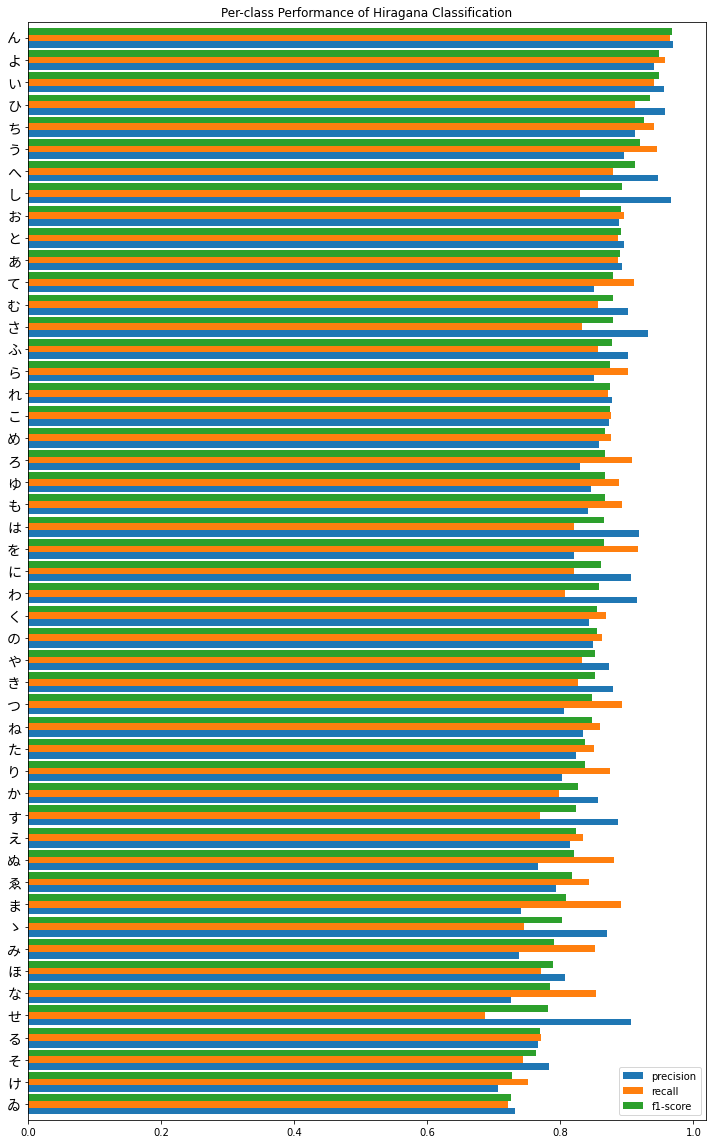
Overall, performance seems fairly good, until we get to the bottom and there is some greater variability in precision versus recall. It’s also interesting to note that we do see poorer performance in the characters we identified earlier which had fewer observations in the training set, the obsolete hiragana ゑ (We) and ゐ (Wi), the latter being in last place. Second to last is け (Ke) which still had a respectable 4714 observations in the training set as opposed to the max / standard of 6000 - perhaps this is due to it being more similar to other characters such as い (I) and は (Ha) which we can investigate further.
This is still a lot of information to take in from one graph, so I am going to try to visualize it better. This is definitely not a standard practice for ML model eval in general, however we do have a couple metrics of interest over a categorical variable with many different values (high cardinality) so the most appropriate visual for this would be a scatterplot.
Let’s take a look the performance of our model on each character by plotting precision against recall for each. I’ll also iterate over each hiragana and add as a data label:
# Plot the initial figure
plt.figure(figsize=(10, 10))
plt.scatter(report_df_joined['precision'], report_df_joined['recall'], s=25)

# Iterate over each hiragana character and add annotation
for i in np.arange(49).astype(str):
    plt.annotate(report_df_joined.loc[i,'char'], (report_df_joined.loc[i, 'precision']*1.005, report_df_joined.loc[i, 'recall']*1.005),
                fontsize=14, fontproperties=fontprop)

# Labels and title
plt.xlabel('Precision')
plt.ylabel('Recall')
plt.title("Recall vs. Precision", fontproperties=fontprop)

# Display
plt.show()
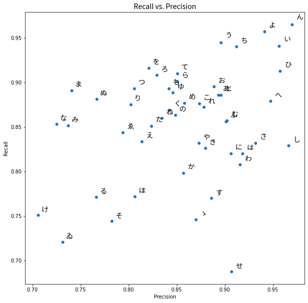
We can see that ゐ and け are in the lower left corner as we noted the model performed worst on them in terms of F1 score. We will now go further and look at which predictions our model made for each hiragana character when it did not predict correctly.
For this we will look at the confusion matrix, where the rows represent the true class label, the columns the predicted label. The values in each entry are the count of predictions for each true class label. Correct predictions lie along the diagonal of the matrix.
I had difficulty here getting font properties to play nicely with sklearn’s ConfusionMatrixDisplay, so I’ve just used the numeric class labels here:
from sklearn.metrics import ConfusionMatrixDisplay

plt.figure(figsize=(20, 20))
ax = plt.gca()
ConfusionMatrixDisplay.from_predictions(y_test, y_pred, ax=ax, colorbar=False)
plt.show()
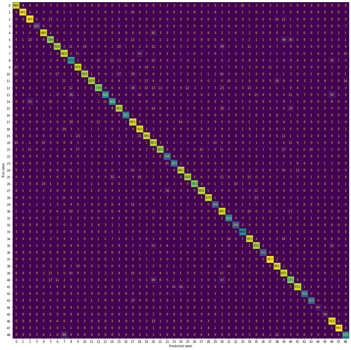
Again, this is a lot of information to take in, given we have 49 different classes. The important thing to note here is that the majority of the count of observations do lie along the diagonal, which means we have a well-performing model. There don’t appear to be any “hot spots” where one character is consistenly mistaken for another in the off-diagonals, though there are some misclassifications as we saw before our model is not perfect.
It’s also difficult to look at this objectively, as here we are looking at the count of observations as opposed to the proportion. The number of observations in each class is different, so this is not really an apples-to-apples comparison. There is the normalize=True argument for making this plot, but the result was very difficult to read.
Instead, we can generate the confusion matrix manually and work with the raw counts. I will normalize the values by the total number of observations per row (the number of observations truly in each class). Therefore, the recall for each class will lie along the diagonal, and the values in the off-diagonal will be the proportion of characters in the row which the model incorrectly predicted to be the value in the column (the per-class false negative rate, or FNR):
# Calculate the confusion matrix
cm = confusion_matrix(y_test, y_pred)

# Create a dataframe
cm_df = pd.DataFrame(cm, columns=classmap['char'], index=classmap['char'])

# Normalize by percentage of true values captured (recall)
cm_df_norm = cm_df/cm_df.sum(axis=1)

# These steps important later for usage of .unstack() and not to confuse rows and columns
# Add predicted to columns
cm_df_norm = cm_df_norm.add_prefix('predicted ')

# Add true to rows
cm_df_norm.index = 'true ' + cm_df_norm.index

# Check
cm_df_norm.head()
| char | predicted あ | predicted い | predicted う | predicted え | predicted お | predicted か | predicted き | predicted く | predicted け | predicted こ | ... | predicted り | predicted る | predicted れ | predicted ろ | predicted わ | predicted ゐ | predicted ゑ | predicted を | predicted ん | predicted ゝ |
|---|---|---|---|---|---|---|---|---|---|---|---|---|---|---|---|---|---|---|---|---|---|
| char | |||||||||||||||||||||
| true あ | 0.886 | 0.008 | 0.000 | 0.000000 | 0.007 | 0.003 | 0.001 | 0.000 | 0.001304 | 0.000 | ... | 0.001 | 0.002 | 0.000 | 0.011494 | 0.005128 | 0.000000 | 0.0 | 0.003 | 0.000 | 0.000000 |
| true い | 0.000 | 0.941 | 0.000 | 0.000000 | 0.003 | 0.002 | 0.000 | 0.001 | 0.001304 | 0.000 | ... | 0.001 | 0.000 | 0.004 | 0.000000 | 0.000000 | 0.000000 | 0.0 | 0.000 | 0.000 | 0.000000 |
| true う | 0.000 | 0.000 | 0.945 | 0.000000 | 0.000 | 0.013 | 0.001 | 0.002 | 0.002608 | 0.002 | ... | 0.012 | 0.001 | 0.000 | 0.000000 | 0.000000 | 0.000000 | 0.0 | 0.000 | 0.000 | 0.000000 |
| true え | 0.000 | 0.001 | 0.000 | 0.833333 | 0.000 | 0.000 | 0.000 | 0.001 | 0.000000 | 0.000 | ... | 0.000 | 0.001 | 0.000 | 0.000000 | 0.000000 | 0.000000 | 0.0 | 0.000 | 0.000 | 0.012195 |
| true お | 0.005 | 0.003 | 0.000 | 0.000000 | 0.895 | 0.006 | 0.000 | 0.000 | 0.001304 | 0.000 | ... | 0.000 | 0.001 | 0.001 | 0.000000 | 0.000000 | 0.014706 | 0.0 | 0.005 | 0.001 | 0.001742 |
5 rows × 49 columns
Now, we can flatten this matrix into a dataframe of pair-wise combinations of the true values and predicted values, and the percentage of hiragana they make up for for each true label:
# Unstack the dataframe
flattened = pd.DataFrame(cm_df_norm.unstack())

# Rename the multi-index
flattened.index = flattened.index.rename('char1', 0).rename('char2', 1)

# Rest to remove the multi-index
flattened = flattened.reset_index().rename({0:'pct'}, axis=1)

# Check
flattened.head()
| char1 | char2 | pct | |
|---|---|---|---|
| 0 | predicted あ | true あ | 0.886 |
| 1 | predicted あ | true い | 0.000 |
| 2 | predicted あ | true う | 0.000 |
| 3 | predicted あ | true え | 0.000 |
| 4 | predicted あ | true お | 0.005 |
Now we’ll drop the entries which occurred along the diagonal, as we are only interested in where the model has made mistakes, and also concatenate the true and predicted labels to a single string and have this serve as our index for convenience (and for plotting shortly):
# Keep only rows not on the original diagonal
flattened = flattened[flattened['char1'].str.split(' ', expand=True)[1] != flattened['char2'].str.split(' ', expand=True)[1]]

# Create a new index of pairs for plotting
flattened.index = flattened['char2'] + ' ' + flattened['char1']
flattened.drop(['char1', 'char2'], axis=1, inplace=True)

# Check
flattened.sort_values(by='pct', ascending=False)
| pct | |
|---|---|
| true ふ predicted ぬ | 0.089286 |
| true ゝ predicted く | 0.084000 |
| true や predicted ゑ | 0.062500 |
| true し predicted ゑ | 0.062500 |
| true る predicted ゐ | 0.058824 |
| ... | ... |
| true む predicted ぬ | 0.000000 |
| true み predicted ぬ | 0.000000 |
| true ま predicted ぬ | 0.000000 |
| true ひ predicted ぬ | 0.000000 |
| true ん predicted ゝ | 0.000000 |
2352 rows × 1 columns
Finally, we can plot the result, and take a look at the hiragana which the model most frequently misclassified (proportionally speaking):
# Find Top 10 greatest and plot
flattened.sort_values(by='pct').nlargest(10, 'pct').sort_values(by='pct', ascending=True).plot(kind='barh')
plt.yticks(fontproperties=fontprop)
plt.show()
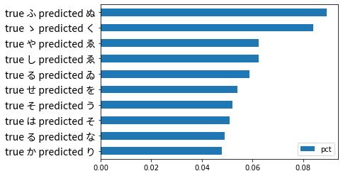
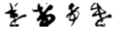
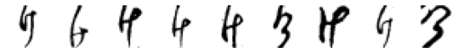
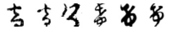
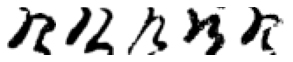
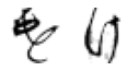
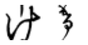
We can see that ふ (Fu) is most frequently mistaken to be ぬ (Nu). Let’s take a look at this misclassification in more detail and see if there is anything notable visually.
For convenience, and because working with raw indexing and numpy arrays is often cumbersome, I’ll construct a dataframe with the true and predicted labels along with the class labels. Then we can filter using these and use the index of this data frame to get back the images we want from the X_test data.
# Create a dataframe of the true and predicted values
pred_df = pd.DataFrame({'true':y_test, 'predicted':y_pred})

# Create columns holding the true and predicated characters
pred_df['true_char'] = pred_df['true'].astype(str).map(classmap['char'])
pred_df['pred_char'] = pred_df['predicted'].astype(str).map(classmap['char'])

# Check
pred_df.head()
| true | predicted | true_char | pred_char | |
|---|---|---|---|---|
| 0 | 19 | 19 | と | と |
| 1 | 23 | 23 | ね | ね |
| 2 | 10 | 10 | さ | さ |
| 3 | 31 | 33 | み | め |
| 4 | 26 | 26 | ひ | ひ |
Great, now we can filter out the rows where the true value was ふ but the model predicted ぬ:
# Looking at
fu_df = pred_df[(pred_df['true_char']=='ふ') & (pred_df['pred_char']=='ぬ')]

fu_df.head()
| true | predicted | true_char | pred_char | |
|---|---|---|---|---|
| 1021 | 27 | 22 | ふ | ぬ |
| 1951 | 27 | 22 | ふ | ぬ |
| 2023 | 27 | 22 | ふ | ぬ |
| 2477 | 27 | 22 | ふ | ぬ |
| 3936 | 27 | 22 | ふ | ぬ |
Let’s take a look at how many observations this represents:
fu_df.shape
(30, 4)
Only 30. Not that many, so we will just hard-code a nice 5x6 subplot grid to inspect these characters visually:
# Code from Part 1
fig, axes = plt.subplots(5, 6, figsize=(20, 8))

for j in range(0, 30):
# Iterate over of the sample images per class and add to the subplot grid
  plt.subplot(5, 6, j+1)
  plt.title(fu_df.index[j])
  plt.imshow(X_test[fu_df.index[j], :, :], cmap='gray_r')
  plt.axis('off') # hide axes

plt.suptitle('True ふ incorrectly classified as ぬ', fontproperties=fontprop, fontsize=20)
plt.show()
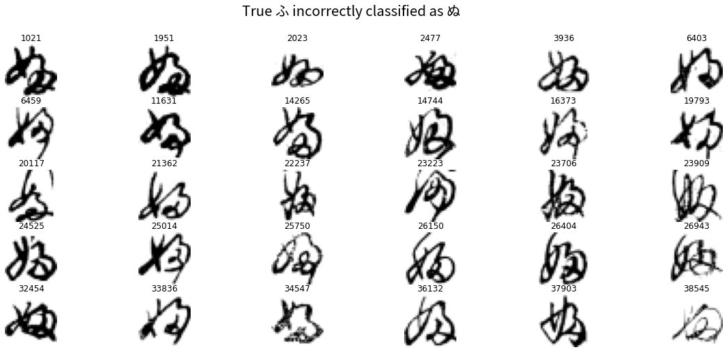
You can see how these were easily misclassified. Almost all contain the little loop on the lower bottom right which is distinctive of ぬ. This may be another case where the handwritten version of the hiragana is quite different from the “canonical” form as it appears in fonts (as I noted in Part 1).
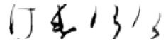
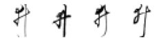
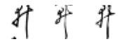
Let’s now go and look in more detail at the characters which the model performed worst on: け (Ke) and ゐ (Wi). Now that we already have pred_df constructed, it should be straightforward to pull out the rows as we did above, only now we are looking for those where the predicted character is any which does not match the true. We’ll do this first for Ke:
ke_df = pred_df[((pred_df['true_char']=='け') & (pred_df['pred_char']!='け'))]

ke_df.head(5)
| true | predicted | true_char | pred_char | |
|---|---|---|---|---|
| 44 | 8 | 35 | け | や |
| 291 | 8 | 40 | け | る |
| 307 | 8 | 46 | け | を |
| 437 | 8 | 46 | け | を |
| 805 | 8 | 1 | け | い |
There are now going to be multiple characters which the model incorrectly predicted the け characters to be:
# Find the distinct other characters
wrong_chars = ke_df['pred_char'].unique()

print(wrong_chars)
['や' 'る' 'を' 'い' 'も' 'り' 'た' 'こ' 'そ' 'す' 'せ' 'の' 'ま' 'な' 'と' 'れ' 'ふ' 'ぬ'
 'つ' 'ら' 'お' 'に' 'き' 'ろ' 'よ' 'あ' 'か' 'は' 'ほ' 'ち' 'ん' 'み' 'へ' 'ひ']
Now we can iterate over each of these, pull out the rows and plot!
for wrong_char in wrong_chars:

  wrong_index = ke_df[ke_df['pred_char']==wrong_char].index
  n = len(wrong_index)

  # Code from Part 1
  fig, axes = plt.subplots(n, 1, figsize=(n, 1))

  print('True: け, Predicted: ' + wrong_char)

  # Iterate over of the sample images per class and add to the subplot grid
  for j in range(0, n):
      plt.subplot(1, n, j+1)
      plt.imshow(X_test[wrong_index[j], :, :], cmap='gray_r')
      plt.axis('off') # hide axes
  plt.show()
True: け, Predicted: や
True: け, Predicted: る
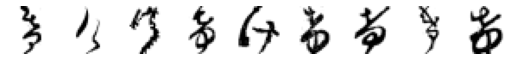
True: け, Predicted: を

True: け, Predicted: い
True: け, Predicted: も
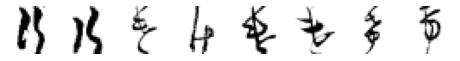
True: け, Predicted: り
True: け, Predicted: た

True: け, Predicted: こ
True: け, Predicted: そ

True: け, Predicted: す
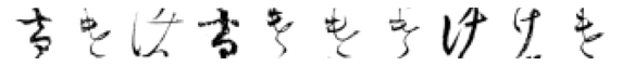
True: け, Predicted: せ
True: け, Predicted: の
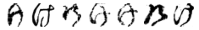
True: け, Predicted: ま
True: け, Predicted: な

True: け, Predicted: と
True: け, Predicted: れ
True: け, Predicted: ふ

True: け, Predicted: ぬ
True: け, Predicted: つ
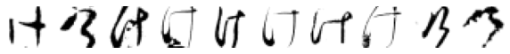
True: け, Predicted: ら
True: け, Predicted: お
True: け, Predicted: に
True: け, Predicted: き
True: け, Predicted: ろ
True: け, Predicted: よ

True: け, Predicted: あ
True: け, Predicted: か
True: け, Predicted: は
True: け, Predicted: ほ
True: け, Predicted: ち
True: け, Predicted: ん

True: け, Predicted: み
True: け, Predicted: へ

True: け, Predicted: ひ

Hmm, some of these are more puzzling than others. And some definitely do not look like け. Again, I am wondering if there are in fact, some mislabelled images in the original dataset?
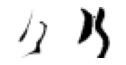
Otherwise, there are some interesting patterns. In the 4th row, it is easy to see how those characters could easily be mistaken for い. This is also definitely the case for the row for の, where the drawn characters have the distinctive curvature and connecting moon shape where the pen has not been lifted.
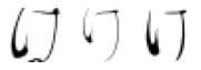
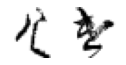
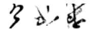
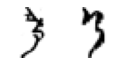
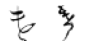
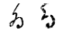
I was hoping for a little more obvious insight there, but as we’ve seen already, the Kuzushiji-49 is not a simple and “clean” image dataset like the original MNIST. Let’s see if there is anything more obvious in the other character the model performed poorer on, the obsolete ゐ (Wi) character.
We follow the same steps here with filtering the prediction data frame for indexing purposes, then iterating and plotting as above with Ke:
wi_df = pred_df[((pred_df['true_char']=='ゐ') & (pred_df['pred_char']!='ゐ'))]

wi_df.head(5)
| true | predicted | true_char | pred_char | |
|---|---|---|---|---|
| 2767 | 44 | 40 | ゐ | る |
| 5784 | 44 | 15 | ゐ | た |
| 6231 | 44 | 27 | ゐ | ふ |
| 6767 | 44 | 5 | ゐ | か |
| 10343 | 44 | 27 | ゐ | ふ |
# Find the distinct other characters
wrong_chars = wi_df['pred_char'].unique()

print(wrong_chars)
['る' 'た' 'ふ' 'か' 'も' 'ゆ' 'け' 'な' 'り' 'ぬ' 'あ' 'そ']
There appear to be less unique characters Wi is mistaken for than Ke. Let’s take a look:
for wrong_char in wrong_chars:

  wrong_index = wi_df[wi_df['pred_char']==wrong_char].index
  n = len(wrong_index)

  # Code from Part 1
  fig, axes = plt.subplots(n, 1, figsize=(n, 1))

  print('True: ゐ, Predicted: ' + wrong_char)

  # Iterate over of the sample images per class and add to the subplot grid
  for j in range(0, n):
      plt.subplot(1, n, j+1)
      plt.imshow(X_test[wrong_index[j], :, :], cmap='gray_r')
      plt.axis('off') # hide axes
  plt.show()
True: ゐ, Predicted: る
True: ゐ, Predicted: た

True: ゐ, Predicted: ふ

True: ゐ, Predicted: か

True: ゐ, Predicted: も

True: ゐ, Predicted: ゆ

True: ゐ, Predicted: け
True: ゐ, Predicted: な
True: ゐ, Predicted: り

True: ゐ, Predicted: ぬ

True: ゐ, Predicted: あ

True: ゐ, Predicted: そ

Far fewer observations here, so not much to say. I think the ones which were mistaken for け really do look more like it than what they are labelled as. I find the above analysis a little disappointing - however there is some simple visual takeaways which offer insight into why the model misclassified certain observations (especially if a human would do so as well).
We will stop our analysis here. A final step before wrapping everything up is to save copies of the final trained model as well as the predictions and dataframe we made, in case we want to pick up from this point later on:
# Save everything
ks_model.save('model/')
np.save('y_pred.npy', y_pred)
pred_df.to_csv('pred_df.csv', header=True)
# Move to Drive
!cp -r model /content/drive/MyDrive/kuzushiji/model
!mkdir /content/drive/MyDrive/kuzushiji/output
!cp y_pred.npy /content/drive/MyDrive/kuzushiji/output
!cp pred_df.csv /content/drive/MyDrive/kuzushiji/output
Conclusions
We have covered some of the fundamentals of building convolutional neural networks working with the toy dataset of the Kuzushiji-49. We have really just scratched the surface here, as there are far more advanced approaches which can be applied, as well as considerable effort which can be put into exploring the space of different architectures and how they would result in better performance.
From a coding standpoint, building and training neural networks for computer vision in Tensorflow using Keras is relatively straightforward; as with most machine learning, the work and care is not necessarily in implementation but in interpreting and understanding the data itself, how to select the best model, and interpreting the model performance.
One of the shortcomings of neural networks is that they are generally considered to be a black box model which makes interpretability and understanding how the model makes decisions challenging. This is changing, as there are now meta-model approaches for understanding model attention, or simpler approaches such as visualizing the network activations.
For our simple problem covering some of the fundamentals of deep learning and machine learning we will stop here. I hope you’ve enjoyed reading.